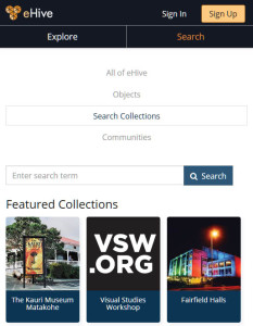
We’re excited to be launching the revamped, rebranded eHive website. The main changes are to support mobile access from smaller screens, such as phones and tablets, and to comply with accessibility standards. This redesign tackles just the essential changes required for us to support mobile and accessible access, but we’ll be continuing to fine-tune things over the next few months.
Technology upgrade
This is the completion of our project to replace the technology used in eHive web pages. eHive was first launched in 2008 and we’ve used largely the same set of technology on our web pages since then. This was making it difficult for us to maintain the site and add new features. It’s been a huge task to redevelop the site, but this now allows us to make further enhancements more easily and more frequently.
Mobile support

Access to eHive from mobile devices has grown rapidly over recent years. Currently 20% of all page views are from mobile phones and a further 12% from tablets such as iPads. This has made mobile support an essential task as part of the redesign.
Each eHive page now has a responsive design with the layout changing to fit the screen size of the user’s device. This has led to a stronger emphasis on images within the mobile pages. We’ve also gained speed improvements across the whole site as we now deliver image sizes tailored to the device and load some content in the background after the main details on a page are displayed.
These changes also allow account holders to make use of the logged in features within eHive on other devices, particularly tablets which have a smaller screen size than our older fixed width web design.
Rebranding
We’ve given eHive a more modern design, updating the logo and colour scheme. The new logo is more compact, allowing us to have a slimline main menu and leave more space for the content.
Accessibility compliance
The new colour scheme has higher contrast to meet AAA accessibility standards. We’ve also made many smaller changes to allow the site to work with screen readers for users with accessibility requirements.
Help pages
Earlier this year we launched a new online help and information website info.ehive.com, updating eHive’s help and news pages to better support access from mobile phones and tablets. This latest eHive upgrade complements the Info website and will improve navigation between the two sites.
Minor changes
There are many small changes we’ve made along the way. These include:
- new featured communities, categories and collections to help visitors explore the public content
- drag and drop option to upload images for a collection or community
- icons for sharing pages on popular social networks
- clearer wording for some menu items and page section titles
Next steps
We’ll continue to improve on the next design as we get feedback. Let us know if you spot any problems or have suggestions.
 eHive’s Online Help and Information pages have a new home!
 WWI objects from New Zealand museum collections | He Waihotanga Iho mai i te Pakanga Tuatahi
 Version 4.2.1 of eHive is the latest of a series of upgrades.